FROM SCREEN TO SIGNAGE: WHY DESIGN MUST WORK EVERYWHERE
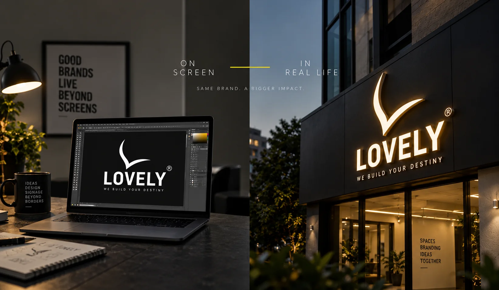
A logo can look perfect on a screen and still fail completely on a wall.
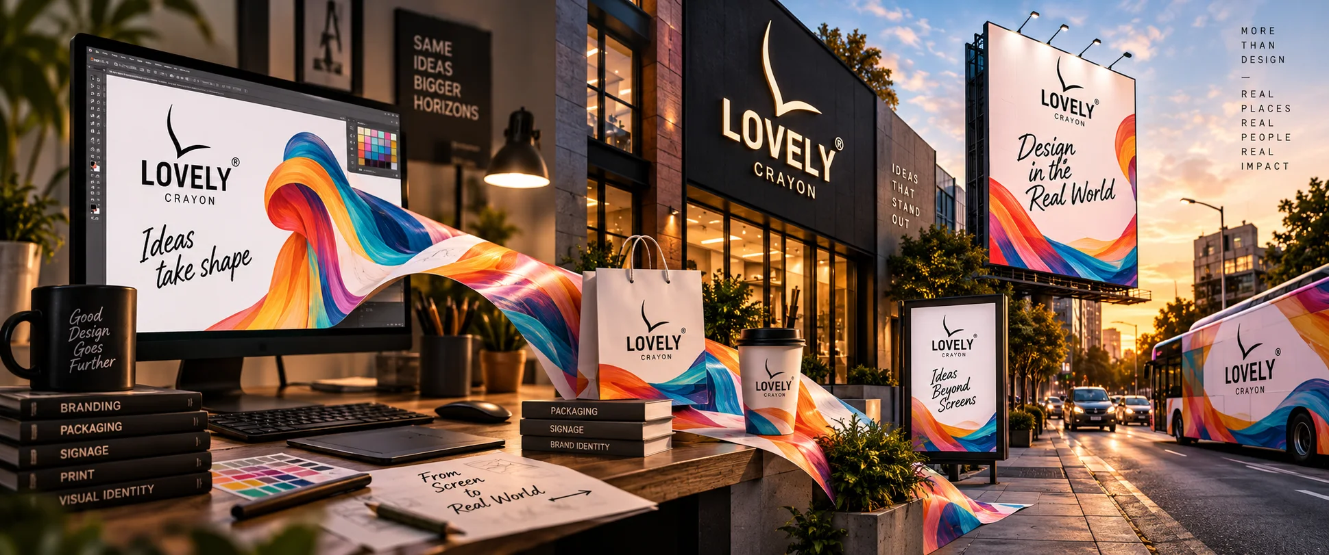
Every logo begins the same way: on a screen. A designer zooms in at 400%. They nudge a curve by half a pixel. They test the logo on white, then on black, then on a soft gradient that will probably never be used again. Everything looks flawless – sharp edges, perfect spacing, colours exactly as intended. Then that same logo gets sent off to become a sign. And suddenly, things that never mattered on a screen start to matter a great deal. This is the part most businesses never think about: graphic design for signage is not the same job as graphic design for a screen. It just looks like it should be.
The Screen Is Forgiving. The Wall Isn't.
A screen is a controlled environment. It's lit from behind, viewed a few inches from your face, in a fixed size, in whatever colour mode the app decides to render. A wall is not controlled at all. It's viewed from ten feet away, then fifty, then from a moving car. It's lit by the afternoon sun, then by nothing at all after dark. It's read in three seconds by someone who was never planning to read anything. A screen asks: does this look good? Signage asks something much harder: does this still work when everything about the viewing conditions has changed? That single difference is why a beautiful digital logo can become a disappointing physical sign – not because the design was bad, but because it was only ever designed for one of its two jobs.
Same Logo, Different Rules
Here's a small but important reality: the moment a logo becomes a sign, it inherits a whole new set of rules that a screen never enforced. Thin lines that look elegant on a monitor can disappear entirely once cut from acrylic or built in metal. A gradient that looked premium in a design file may be impossible to reproduce evenly in an illuminated channel letter. A clever little icon tucked beside the wordmark might read as a smudge from across a parking lot. None of this means the original design was wrong. It means signage has physical laws that screens simply don't.
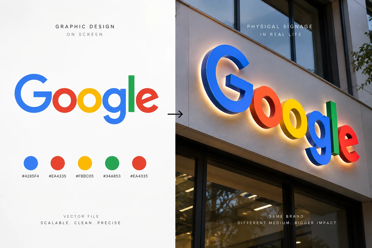
A good design system already accounts for this. It doesn't just define a logo – it defines how that logo behaves when it's small, when it's huge, when it's lit from within, and when it's engraved instead of printed. That's the real difference between a logo and a brand identity: one is a picture, the other is a set of instructions for every situation the picture will ever be in.
Color Doesn't Behave the Same Way Twice
On a screen, colour is made of light. RGB values glow from behind glass, consistent every time, on every device – mostly. On a sign, colour is made of material. Paint, vinyl, acrylic, LED diodes, and powder-coated metal – each one interprets the "same" colour slightly differently. A shade of blue that looks confident on a monitor can look flat, or oddly purple, once it's printed on flex or lit up at night. This is why the brands that photograph well in real life – not just online – are usually the ones that tested their colours in the material they'd actually be built in, not just the file they were designed in.
Typography Has to Survive Distance, Not Just Zoom
A font choice on a website has to survive a scroll. A font choice on a building has to survive distance. Delicate serif fonts, tightly kerned letters, and subtle weight variations can look sophisticated in a brand guideline PDF — and then quietly disappear the moment they're rendered forty feet in the air, viewed by someone driving past at forty kilometres an hour. Good signage typography isn't about looking clever up close. It's about being unmistakable from far away. That's a completely different design problem than making a website look elegant, even though both are technically "graphic design".
When Design Forgets the Physical World
This is where a lot of good creative work quietly falls apart:* a designer creates something excellent for a screen, without ever asking how it will survive becoming three-dimensional, illuminated, weatherproof, and visible from a moving vehicle.* The result is a brand identity that looks award-worthy in a portfolio and slightly awkward in real life – a logo that has to be squeezed, stretched, or simplified at the last minute just to become a usable sign. Design that only works on a screen isn't finished. It's only half-designed. The other half – the part most agencies never think about – is what happens when that same design has to survive sunlight, scale, materials, and weather.
Designing for Both, From the Start
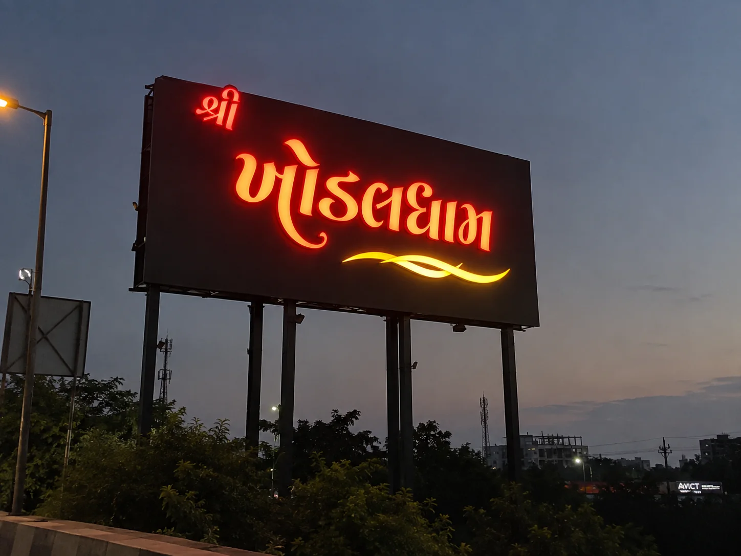
The businesses that get this right don't design a logo and then figure out how to turn it into a sign. They design with both destinations in mind from day one. They ask early: Will this still be legible at three inches and at three metres? Will this colour still feel right lit from behind at night? Does this logo have a simplified version for small or dimensional use? Can this identity survive being cut from metal, not just displayed on glass? That single shift in thinking – designing for the wall as seriously as the screen – is often the real difference between a brand that merely looks good and one that actually gets noticed in the real world.
 lovelycrayon.com
This is also where working with people who understand both sides – the design and the physical build – makes a real difference. A designer who has never had to cut a logo out of acrylic, or a sign-maker who has never thought about typography, will each solve only half the problem.
The Thought to Take Away
"Design is the silent ambassador of your brand."
Paul Rand
A brand's design doesn't stop being its ambassador the moment it leaves a screen. If anything, that's exactly when it starts working the hardest – standing outside, unlit at times, uncontrolled, representing a business to someone who has never met it before. Good graphic design earns attention on a screen. Good signage design has to earn it in the real world – in daylight, at night, from a distance, and at a glance. The best brand identities are the ones built to do both, without ever feeling like two different designs pretending to be one.
Planning signage of your own?
Get a quote→